Config visualization
Motivation
Understanding, handling and debugging preCICE configuration files can be difficult and tedious. As so many problems, also this problem grows superlinear with the size of the input. Especially the configuration of the data-flow can be tricky to get right for beginners and sometimes even seasoned preCICE users.
This tool is supposed to tackle this issue.
It naively interprets the given configuration file and visualizes it as a graph. This has a few important benefits:
- Configuration mistakes can be difficult to spot in XML, but are often trivial to spot in a graph.
- Students and co-workers have less trouble understanding relations of components in a graph format.
- A graph is a good format to present the simulation scenario in presentations
Installation
We provide two python packages ways of visualizing preCICE configurations.
precice-config-visualizerwhich translates preCICE configuration files to a graph and optionally renders them as an image.precice-config-visualizer-guiwhich offers an interactive GUI for the above.
Please first install the dependencies:
python3andpipx(orpip)graphvizfor rendering the result.-
GUI only: dependencies of
pygobjectIn particular, in Ubuntu, you might need to install the following packages:
sudo apt install libcairo2-dev libgirepository2.0-dev gcc libcairo2-dev pkg-config python3-dev gir1.2-gtk-4.0
Then install the latest version straight from PyPI:
pipx install precice-config-visualizer
# To also install the GUI
pipx install precice-config-visualizer-gui
General usage
The configuration visualizer comes with a CLI and a GUI, which serve different purposes:
- Use the GUI to quickly explore a configuration and change the visualization parameters.
- Use the CLI to automatically generate graphs from preCICE configuration files or to heavily customize them to suite your own needs.
Using the GUI
To open the interactive GUI and optionally pass a path to a configuration file:
precice-config-visualizer-gui
# Or directly open the precice-config.xml
precice-config-visualizer-gui precice-config.xml
The application automatically reloads configuration files on change and shows parsing errors at the bottom. This is especially useful for rapid prototyping.
Desktop integration is still lacking with commonly used tools for installing python packages.
If you want your launcher to pick up the tool, you can save this desktop file (right-click > “Save Link As”) manually to the directory ~/.local/share/applications/. The directory may need to be created first.
After logging out and back in, you can start the program using your launcher and even directly open XML files with it.
Using the CLI
There two use-cases for the CLI:
- To directly render the configuration as an image
- To output a DOT graph which can be freely changed and finally rendered as an image
Some common output formats such as png, pdf, svg, and jpg are automatically detected and rendered using graphviz/dot.
Unknown formats will be interpreted as an output for the graph description in the dot language.
To render a preCICE configuration as a PNG image use:
precice-config-visualizer -o graph.png precice-config.xml
To customize the graph further first generate the dot graph:
precice-config-visualizer precice-config.xml > graph.dot
Then you can freely change the graph to your liking. Useful resources are:
- The documentation of the DOT language
- A visualizer such as xdot
Finally, directly use dot to render your final image:
dot -Tpng -O graph.png graph.dot
Controlling the output
For big cases, the generated output can be visually too busy. This is why the tool allows you to control the verbosity of some elements. For some properties, the following options are available:
- full shows the available information in full detail. This is the default.
- merged shows available relations between components without full detail. Multiple edges between components will be merged into a single one.
- hide hides all relations.
These options are currently available for many information types, including:
- data access participants using
read-dataandwrite-datato access data on meshes. - data exchange participants
exchangeing data between meshes. - communicators configured
m2nconnections between participants. - coupling schemes configured
cplschemes between participants. - mapping schemes configured
mappings between meshes.
These options can be visually adjusted in the GUI or passed via command line arguments to the CLI. The GUI also provides some presets, which is a one-click setup of many options. To see the full list of options, run:
precice-config-visualizer --help
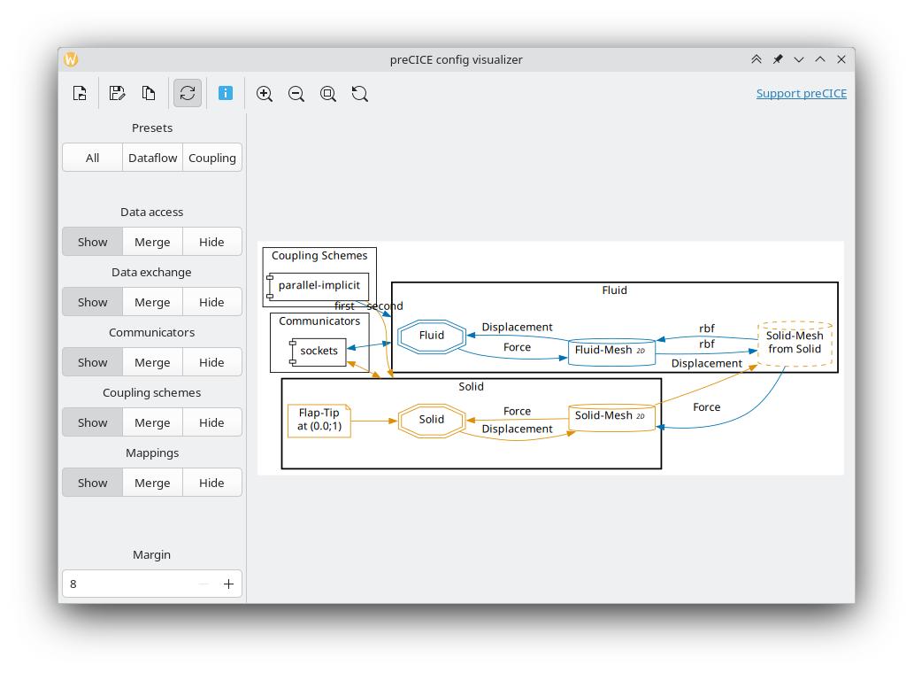
Visual style
Some features are visually encoded without textual annotations:
- Colors represent participants.
- Data exchange has the color of the sending participant.
- Received meshes have the color of the providing participant.
- Data exchange using
initialize="yes"is displayed using bold arrows. - Data exchange using
substeps="yes"is displayed using a double arrow.
Examples
The following examples are based on the elastic-tube-1d tutorial.
The full picture
precice-config-visualizer -o graph.svg precice-config.xml

Reduced information of coupling schemes and communicators
precice-config-visualizer --communicators=merged --cplschemes=merged -o graph.svg precice-config.xml

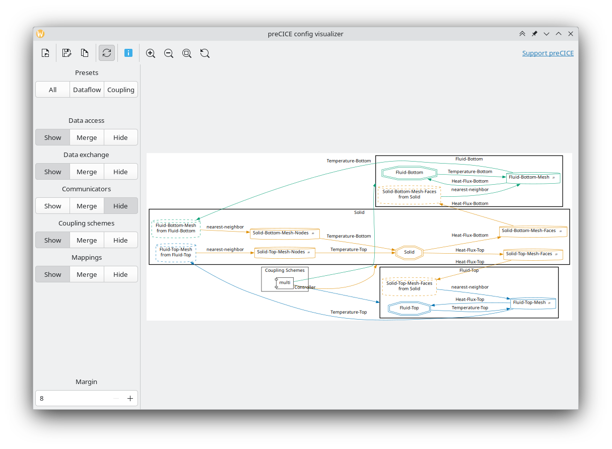
Data flow visualization
precice-config-visualizer --communicators=hide --cplschemes=hide -o graph.svg precice-config.xml
